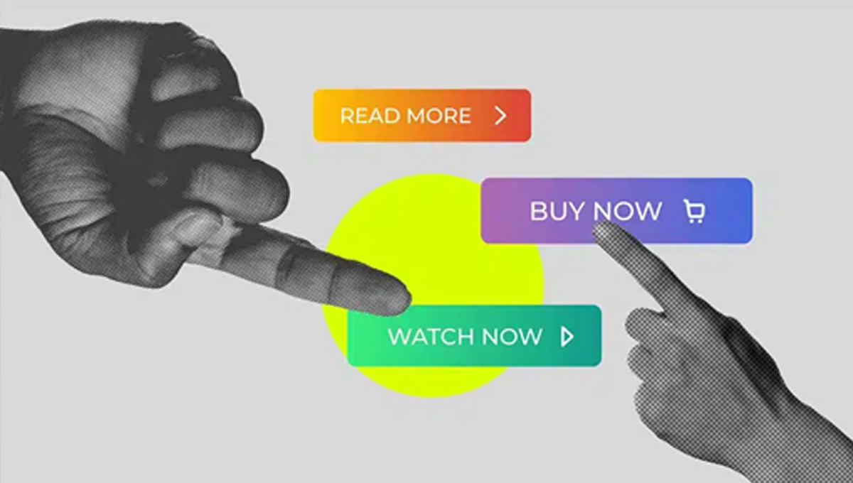
Buttons are undoubtedly an essential element for any user interface because they enable users to take action. A good button follows 6 basic rules to create an effective button that enhances the user experience in any digital product.
Make buttons look like buttons.
When an end user looks at an interface, they should immediately be able to tell if an element is clickable or not. How do we achieve this? In this article, I’ll explain how we can assist end users in using buttons effectively to improve user interface design.
Borders
Borders, as the first visual attribute in this list, enhance the feel of a traditional button and create an eye-catching element for the user. Without the border, the button looks more like a link than a button. This is key to button design principles.
- Links are used for navigation,
- Buttons are used for actions.
Therefore, it’s always better to use at least a visual border to make buttons more distinguishable.

Shapes
Shapes are another visual attribute in our list. Unconventional shapes like stars, triangles, or perhaps a splatter can be very confusing for users. While the shapes may look great, they are not typical for standard button design.

A rectangular object with a label inside is what we call a traditional button. This object can be filled with a solid color or remain hollow. Additionally, the rectangle can be styled with rounded or square corners, commonly seen in modern button designs.
Hierarchy
The most important button is the most visible. Therefore, we collect different types of buttons to indicate the hierarchy to the end user. However, we shouldn’t create more than 3 types of buttons for one landing page or screen, and no more than 10 types for a larger site or app.

Shadows
In addition to shapes, shadows are another popular visual feature in button design. Generally, shadows make an element stand out from the background and easily recognizable as a tappable or clickable element.
Placement & Order
Buttons should be placed where users expect to find them. Conventional button placements improve user discoverability and interface usability.
Design Different Button States
End users should understand the current state of buttons just by looking at them. Therefore, we need to create distinct visuals for all states of buttons to improve user interface clarity.
Place buttons where users expect to find them
Use Conventional Layouts
Don’t make end users search for buttons; place buttons where users can easily find or expect them to be. The position of a button is important, and we should design a layout that makes it easy for users to scan and locate them. Conventional placements for buttons improve discoverability.
Label buttons with what they do
Avoid Generic Labels
Labels directly affect button performance and conversion rates. From the user’s perspective, buttons with generic or misleading labels can be a huge source of frustration. Write button labels that clearly explain what each button does.
Use Verbs
Good labels are helpful — they explicitly prompt the user to perform an action and describe what will happen, such as "Add to Cart" or "Subscribe Now." This makes the user experience clear and intuitive.
Make buttons finger-friendly for all devices
Consider how large a button is in relation to other UI elements on the page. Ensure the buttons you design are big enough for people to interact with comfortably on all devices.
Size and Padding
Ensure your buttons are large enough for users to tap easily, even on smaller screens. Mobile-friendly buttons should be finger-friendly to improve usability.
Rule #5: Avoid too many buttons on one page
Don’t overwhelm users with too many choices. Keep the number of buttons minimal, guiding users to the most important actions.
Pay Attention to Button Order
The order of buttons should reflect the nature of a conversation between the end user and the system. Ensure that the most important buttons appear first, and use consistent patterns to align with user expectations.
Conclusion
Buttons are an essential element in creating a seamless user experience, so it’s worth paying a lot of attention to making this element as effective as possible. Button UX design should always prioritize recognition, accessibility, and clarity to improve the overall user experience.


